


Laurent Ferrier weaves brand DNA into the Classic Moon, complete with a brand first
Borna BošnjakThroughout his many escapades, Laurent Ferrier has probably had a life that many watch fans would aspire to have. Not only did he help bring the Patek Philippe Nautilus to life, among others, and then going on to dedicate his time to creations under his own name, he also led an illustrious racing career, twice standing on the Le Mans podium. Swiftly moving on out of fear of projecting, even without such an interesting backstory, the watches themselves were intriguing and innovative from the very beginning. Whether we’re talking about his Tourbillon Double Spiral, pursuing development of the natural escapement, or simply the aesthetic signature, there’s a throughline of fine finishing that’s distinct to Laurent Ferrier in each and every model. The brand’s latest release – the Laurent Ferrier Classic Moon – is no different, though it goes about respecting these signatures in a slightly different way.
A graduated montre école
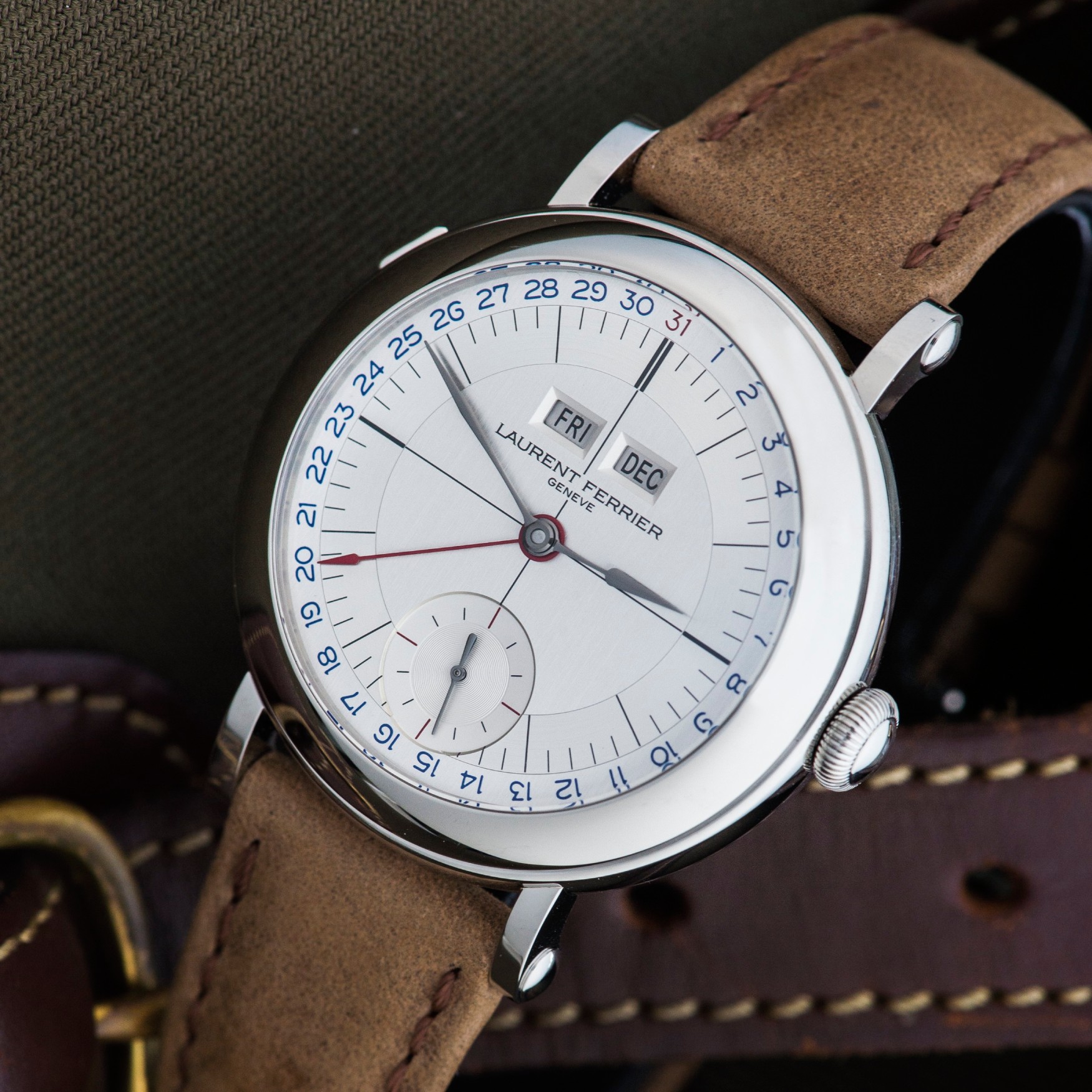
What started with the 2017 Galet Micro Rotor Montre École evolved to feature increasingly complex dial indications, all the while keeping the bassiné case that defined the watch that Ferrier built as an apprentice. The best-known member of this collection, however, is undoubtedly the Galet Annual Calendar Montre École – the watch that won Ferrier the 2018 Men’s Complication award at the GPHGs. Considering its opponents – watches like the Krayon Everywhere Horizon and Ludovic Ballouard Green Line – it needed to be exceptional to win. And it really is. With an in-line indication of the day and month, the pointer date swoops around the dial perimeter to complete a modern piece clearly inspired by the 1940s.
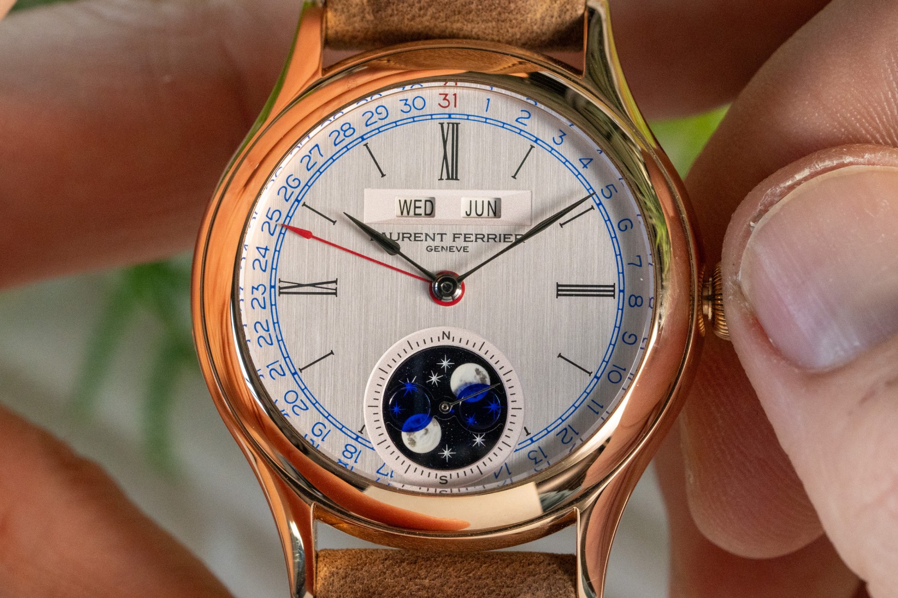
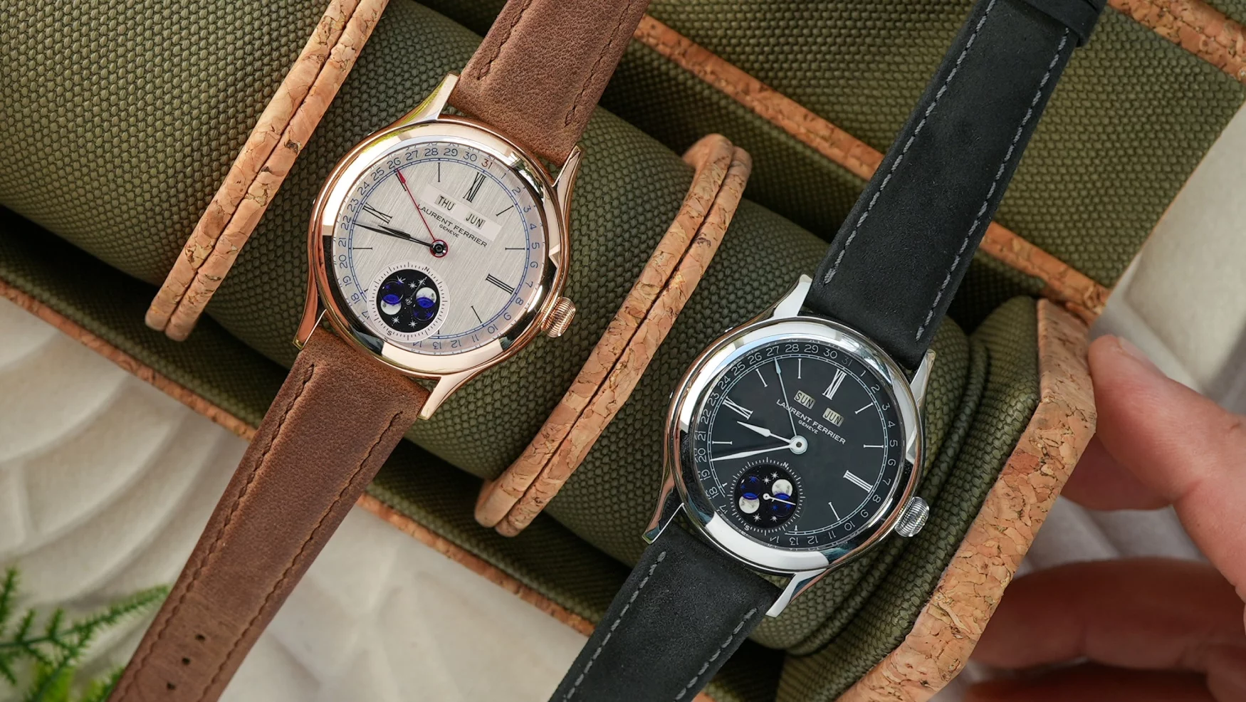
Fast-forward six years, and this brings us to the Laurent Ferrier Classic Moon. The blue and red contrast colours against a light-coloured background immediately allude to the 2017 watch, but with design cues reflecting Laurent Ferrier’s current catalogue. As the Classic Moon gains a complex moonphase sub-dial, gone is the printing that made the Montre École a sector dial to give all the elements some breathing room. And yet, the elegant Roman numerals at 3, 9, and 12 are subtly scaled up, perhaps alluding to the sector dial of its cousin collection.
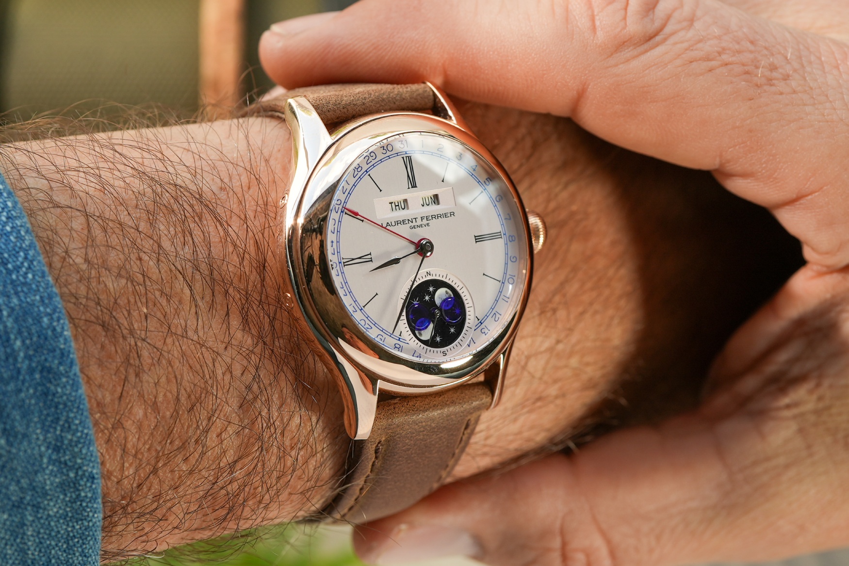
Despite drawing much of his design inspiration from the 1940s, Laurent Ferrier’s cases rarely adhere to the sizing gabarits of the time. That’s not to say that the 40mm cases of the Classic Moon are preposterously large, but they’re definitely a millimetre or two bigger than you may expect from a watch of this style. Furthermore, the Classic Moon softens the lines of the Montre École, smoothing out the transition into the mid-case and doing a more elegant job of hiding the correctors, while rounding out the lug profile.
Unmistakable signatures
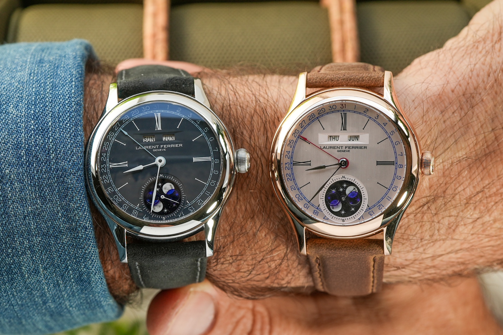
With all that said, the aesthetic qualities of the Classic Moon are to Laurent Ferrier what Greatest Hits is to Queen. A one-stop-shop for anyone who wants to know what the Laurent Ferrier design is about, without needing to delve too deep into its specifics. Of course, this isn’t to say that you couldn’t go deeper, as there’s plenty to discover, and the moonphase complication is a noteworthy novelty. The Classic Moon is Laurent Ferrier’s first moonphase, and subtly plays on a LF quirk that’s often overlooked – and that’s lume. Here, the disc is an engraved piece of aventurine glass with hand-painted, lumed stars and Moons, placed beneath a precise piece of translucent enamel that indicates the correct phase.
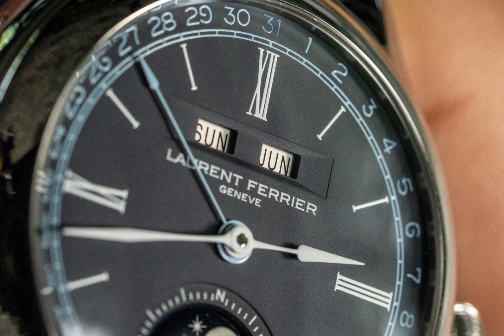
The day and month aperture above the pinion is emphasised by a faceted window reminiscent of the brand’s Sport Auto models, and the cherry on top is the handset. Laurent Ferrier refers to the shape as “assegai”, with the name coming from a spear used in southern Africa. Out of all the hand shapes out there, these would be in the top three for me, though the supremely elegant, polished finish we’re used to has been toned down here with a coat of matte paint for the Classic Moon Blue.
Top-notch decoration
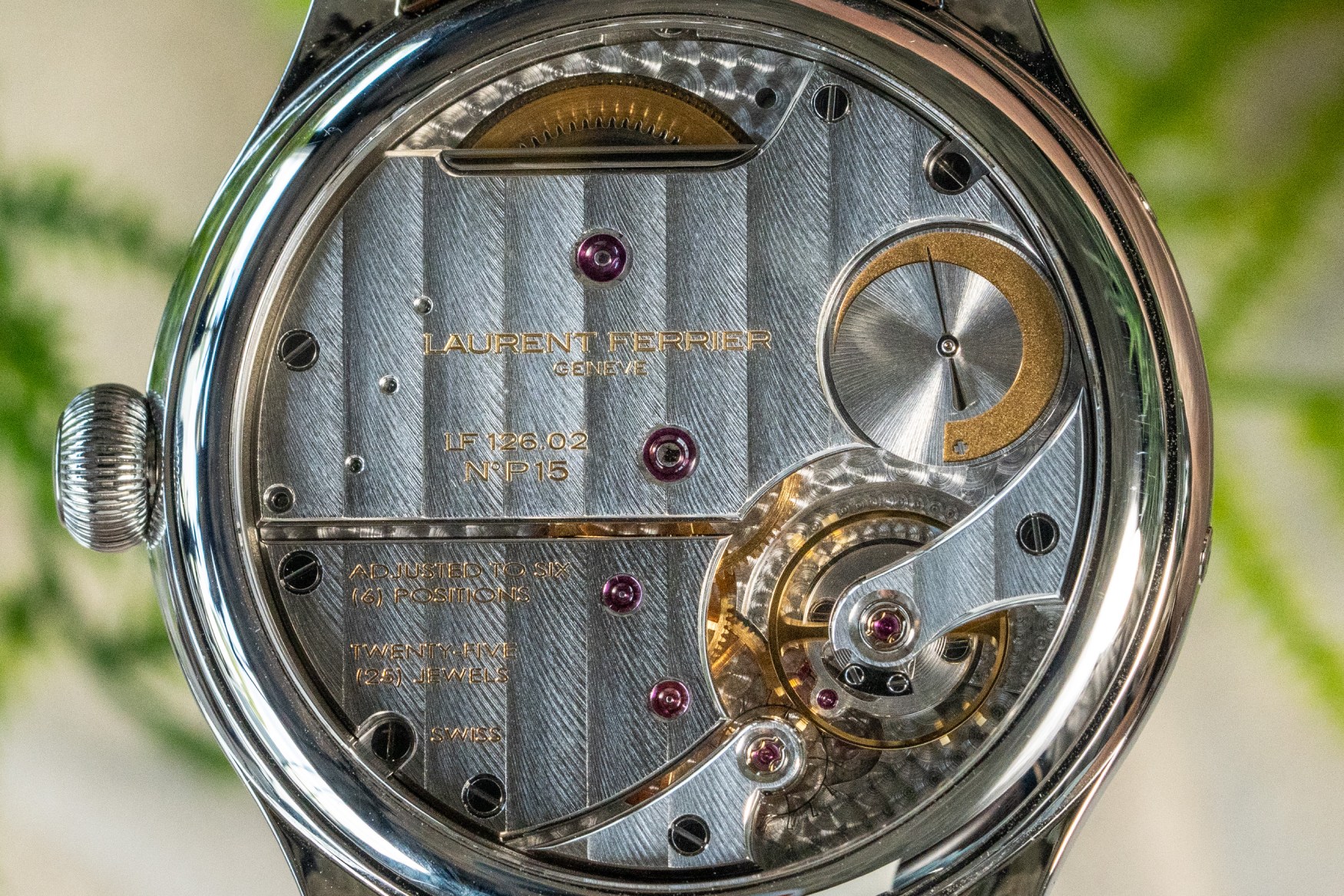
I know some of you were wondering whether I was ever going to get to the movement. Come on, how could I not? In what I promise to be the last reference to the brand’s existing annual calendar pieces, the LF126.02 shares a lot of similarities, though it includes more than 30 new components to go along with its added complication. Laurent Ferrier also notes more than 20 components that have been reconfigured, though this doesn’t directly relate to performance, which remains at a 3Hz beat rate, impressive 80 hours of power reserve, and regulated by a classic Swiss lever escapement.
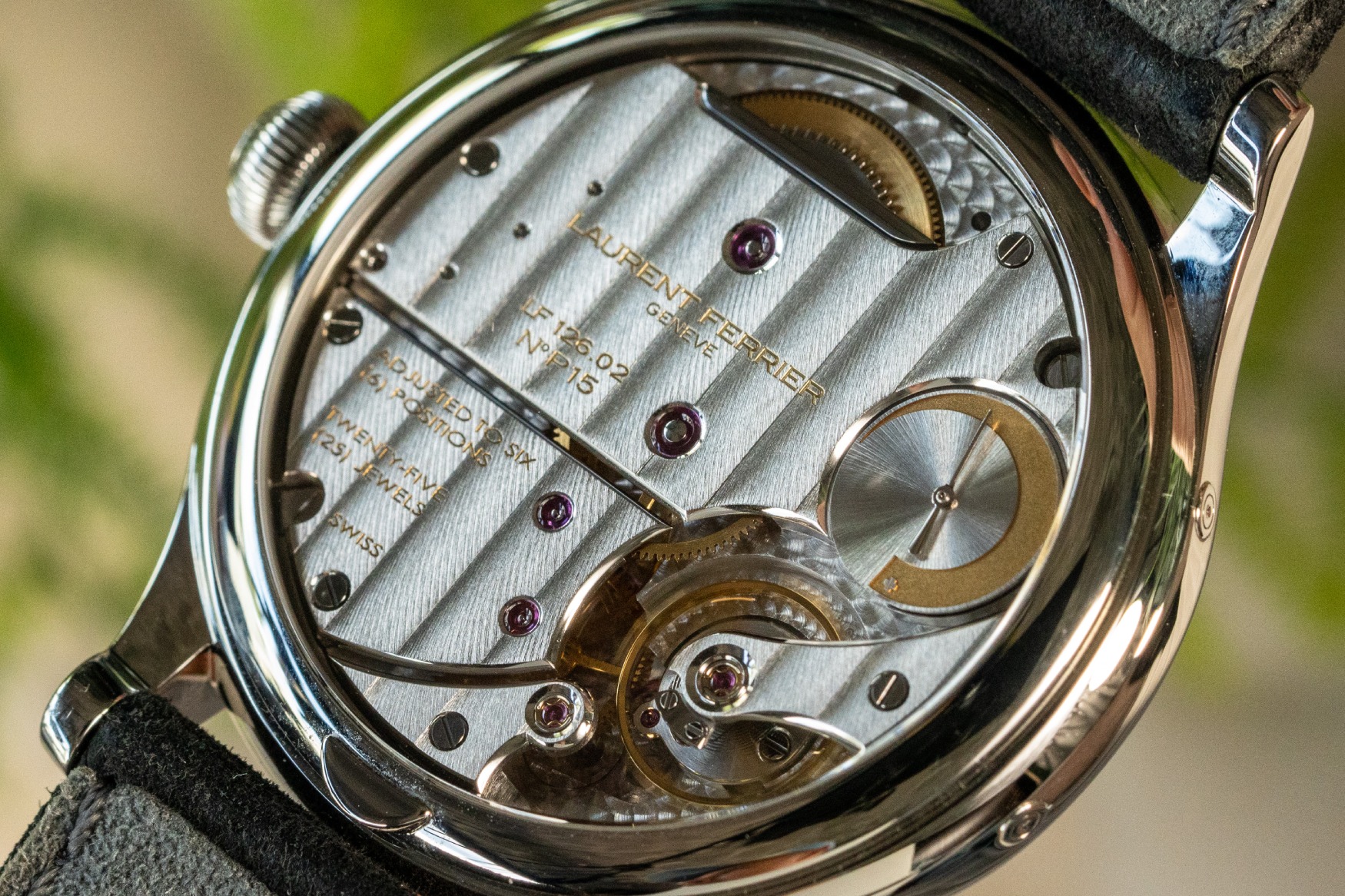
Looking at the specifications on paper, you could get a general idea of how this watch performs. But reading about the decoration will only get you so far. Laurent Ferrier’s manually wound movements hide much of their gear trains with wide bridges, though the brand makes sure you’re not bored, bedecking them with rich, feathery côtes de Genève. The highlight for me is the long, rounded shape of the polished click that hides away at the top of the movement, and gives you a wonderful audible experience when the watch is wound. As for the things you can see, I have to point out the excellent bevelling of all the bridges (including components that may be obscured from view), with the best of them being the stunningly sharp exterior angle in the bottom left corner of the power reserve indicator.